
OverviewMy team's task was to design a product to drive empathy for Woodland Park Zoo. Woodland Park Jr. combines the physical and the digital to create an engaging learning experience for kids and families to drive long-term empathy for wildlife.
Our app in companion works with our scavenger adventure in which families can answer questions and earn points in our app along the way. After the visit, kids can access fun educational animal content like games, activities, and quizzes using the points they've earned during the scavenger adventure. |

|
Define
What problem are we trying to solve? What are our stakeholders values and goals?
The Problem
In the Define stage, we spent some time understanding Woodland Park Zoo’s Empathy Initiative. Their mission with this initiative was to drive social change and motivate people to take caring actions towards animals and nature.
We explored some of the resources the zoo had available such as their best empathy practice frameworks, how to measure empathy, and how to foster empathy for animals using research-based best practices. One of the biggest takeaways from our deep dive was this quote - “When people feel like they can actually make a difference in their actions and know specifically how to make a difference, they are more motivated to do so.” - which highly impacted the way we ideated in future stages.
We explored some of the resources the zoo had available such as their best empathy practice frameworks, how to measure empathy, and how to foster empathy for animals using research-based best practices. One of the biggest takeaways from our deep dive was this quote - “When people feel like they can actually make a difference in their actions and know specifically how to make a difference, they are more motivated to do so.” - which highly impacted the way we ideated in future stages.
Our Stakeholders
We had a brief initial meeting with Woodland Park Zoo to understand their core values, goals, and some success metrics. Here's what we learned:
|
Values & Goals 🎯
• The zoo was looking to engage their primary visitors into the physical environment for a more memorable experience
• They wanted to have a long-term impact that lasted past zoo visits since people typically only visit once a year • Highly values the physical and natural environment of the zoo - had worries about adding technology into the experience in fear of it taking away from the current feel |
Success Metrics 🙌
|
Research
Who are the primary and secondary audiences? What do we know? What else do we need to find out?
Ethnography
We also did some ethnographic research to observe key behaviors and problem areas. During our zoo visit, we gathered lots of insights, many of which went against our initial assumptions and views of zoos. Here's what we learned:
- Their primary visitors were parties with younger children
- The zoo's current strengths regarding empathy was their storytelling - giving their animal ambassadors names and stories to paint the picture of their lives.
- Their largest room for improvement was the lack of content and engaging things actually tailored towards kids. Most of it was adult friendly but a kid wouldn't be able to comprehend it easily.
- Parents really cared about their kids' experience - they tried really hard to engage their kids during the zoo visits in different creative ways which sometimes didn't work.
Secondary Research
For many members on my team, this would be our first time designing for younger kids. We decided on some key things that would be important to know about this audience and then split up the research responsibilities. After this, we came together to share the most important findings that might influence our next steps.
|
Color Theory 🎨
We learned that different colors were associated with different characteristics and ideas. Diving into what colors meant for kids specially, we decided that a green, blue, and orange color scheme would be perfect as blue is calming and encourages creativity while orange enhances critical thinking and memory.
Language 🗣
We learned that framing our language and stories about the animals would make a big difference in our impact. Giving the animals names, using he/she and describing them past just their habitat and diet, but also about their emotional and behavioral traits would help drive empathy in children.
|
Kids & Technology 📱
We found that kids up to 11 years old typically did not have access to technology outside of the home - which would mean our product would likely primarily be guided on the parents phones at the zoo. This would influence the type of product we create and even how we design the interface.
Attention Span 🧩
Kids ages 6-11 typically stay interested from anywhere from 12-23 minutes. Some of the best ways to maintain this attention were including a gamified element, creating a reward system, and watching their parent/guardian also participating and/or maintaining their own attention as example behavior.
|
User Interviews
We split up to interview parents and kids to learn their typical journey through the zoo, gauge how they felt about that experience, and figure out how parents felt about technology inside the zoo. (mention small sample size)
|
Parents 👩👦
We found out that parents were open to technology in the zoo for their kids if it was educational. They usually struggled with getting their kids to stay interested in animals unless it was the kids favorite animal which they would interact with the most.
Multiple parents also highly struggled with the lack of a virtual map option, which made their experience difficult and frustrating in general. We took note of this to possibly address this pain point in our product. All in all, they wanted their kids to have fun and learn during this visit as the visit was mostly for them. |
Kids 👧🏽
Kids really wanted to have fun while at the zoo. Some kids expressed that they usually learned about animals via YouTube or in school sometimes, but not very often.
They also expressed their favorite animals and most memorable experiences from the zoo which usually had to do with interacting with their favorite animals. (Note: we also learned that kids are more likely to interact with animals they know something interesting about). They also expressed interest in gaining prizes in the zoo during their visit, for example a goodie bag or other rewards. |
Audience
Based on our research, how are we defining our target audiences?
We decided that our primary target audience would be kids ages 6-11 since younger children typically were being - brought to the zoo. Along with this, we wanted to ensure our range started at an age where kids were either learning to read or already knew how to read, which is typically ages 6 or 7, to participate in our apps learning content. We capped the age at 11 since teenage kids are a different audience with different engagement requirements to consider in our design (which we could explore at later times). Our secondary audience was defined as parents bringing their children to the zoo. We then created primary and secondary personas based on that.
|
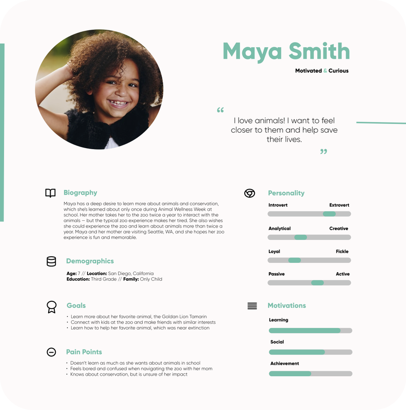
Primary Persona 👧🏽
Our first persona represents a curious kid visiting the zoo with her mother who's ready to have fun and learn.
|
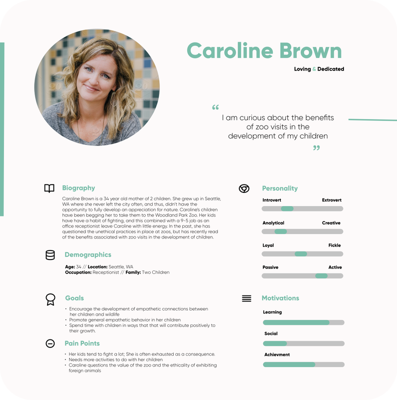
Secondary Persona 👩🏼
Our second persona represents a dedicated parent bringing her daughter to the zoo for their annual visit.
|
Ideation
What's our solution? Is it in line with the problem, our users, and stakeholders?
Idea #1 ❌
An informational app tailored for kids that provided fun and surprising facts about zoo animals through visuals and language they could understand better.
|
Pros
• Creates a learning environment for kids through information that's more accessible and interesting • Can push empathy through understanding information • Attractive to parents who want their kids to take higher learning objective from the zoo experience |
Cons
• Little to no physical interaction involved - goes against stakeholder values and goals • Adds more to the load of information already at the zoo in which many people were already interacting with - Cognitive Overload • Kids in the age range we're designing for typically don't have access to tech outside of the home - so app information will likely still be relayed through the parent just instead from the phone (similar to the current zoo experience where parents read the animals information board and explain it to their children) - No unique value. |
Idea #2 ❌
A mobile app scavenger hunt which shows the different places animal's are located. Once visitors reach the animals location, they can check that animal off the list in the app and maybe earn a goodie bag or some type of reward.
|
Pros
• Might encourage kids to visit more animals if they see how many there are to find on the map, extending zoo visits • Could give incentive for kids engage with animals or explore in the zoo - finding animals and checking them off to get rewards • Addresses lack of a virtual map pain point |
Cons
• No clear opportunities to push conservation and learn • Very similar a scavenger hunt experience the zoo has already tried in their environment which didn't do very well - No unique value or differences • Not enough reason for kids to want to continue engaging in this experience, especially if they've already found all of the animals in one or two visits. |
Idea #3 ⭐
A physical scavenger hunt and companion mobile app to answer conservation questions and earn points along the way with access to at home learning content that's unlocked with points earned in the zoo.
|
Pros
• Balances the physical and the digital experience while still putting heavy emphasis on the physical the most • Adds in a reward system to keep kids engaged and encourage them to participate • Pushes empathy long-term with the at home learning content that's accessed with points earned during zoo visit • Conservation questions show people exactly how they can make a difference (empathy initiative) |
Cons
•. Still might be too much tech involved if we're not careful about when and where we incorporate in zoo technology use • Might not push empathy long-term if we don't emphasize and encourage the points and rewards system enough while showing the value of using those rewards and points for at home content |
The Decision
Idea number three was widely chosen, though there was some push back on this decision within my team. While most were on board, one member had valid concerns about this still being too much technology for the physical environment. I was pretty confident in our team's ability to balance the physical and the digital if we were intentional about when technology was required, as well as the benefits in comparison to the negatives of adding some technology into the environment in a largely tech society. Along with this, I knew that other zoos had incorporated technology into their experiences in different ways and have been very successful. Within my proposal plan to get my team member on board, one of main pieces of information I found was this:
"Smartphone activities were the most enticing… they enhanced and extended visitors’ experiences at the corresponding exhibits and zoo visitors tend to represent the general public in their use of cell phones and smartphones who when given the opportunity, do choose to interact with hand-held technology around an exhibit.” Visitors suggested that they might not want to use mobile phones during their zoo visit because it might detract from family time; however, observations by the researchers did not support these statements.” - North American Association for Environmental Education
After another conversation within the team about ideas, and getting advice from our other peer designers and others, we decided to go with idea three as it seemed to have the least cons and most valuable outcomes that matched with our stakeholders goals and values along with our research.
Tiny Difference - Big Influence
When talking about our idea to others, a person in one of these conversations expressed that she immediately felt offset by our use of the term "scavenger hunt" to describe our product which was made for a zoo. As soon as she heard the word hunt, she started thinking about the negatives of hunting animals and unconsciously tied these negative thoughts to our product going forward. We highly took this into consideration and decided to figure out different wording to describe our experience which also influenced our product's name overall. After some brain dumping and research on alternative words, we decided to make a tiny word alteration which helped remove those negative associations.
Scavenger Hunt → Scavenger Adventure
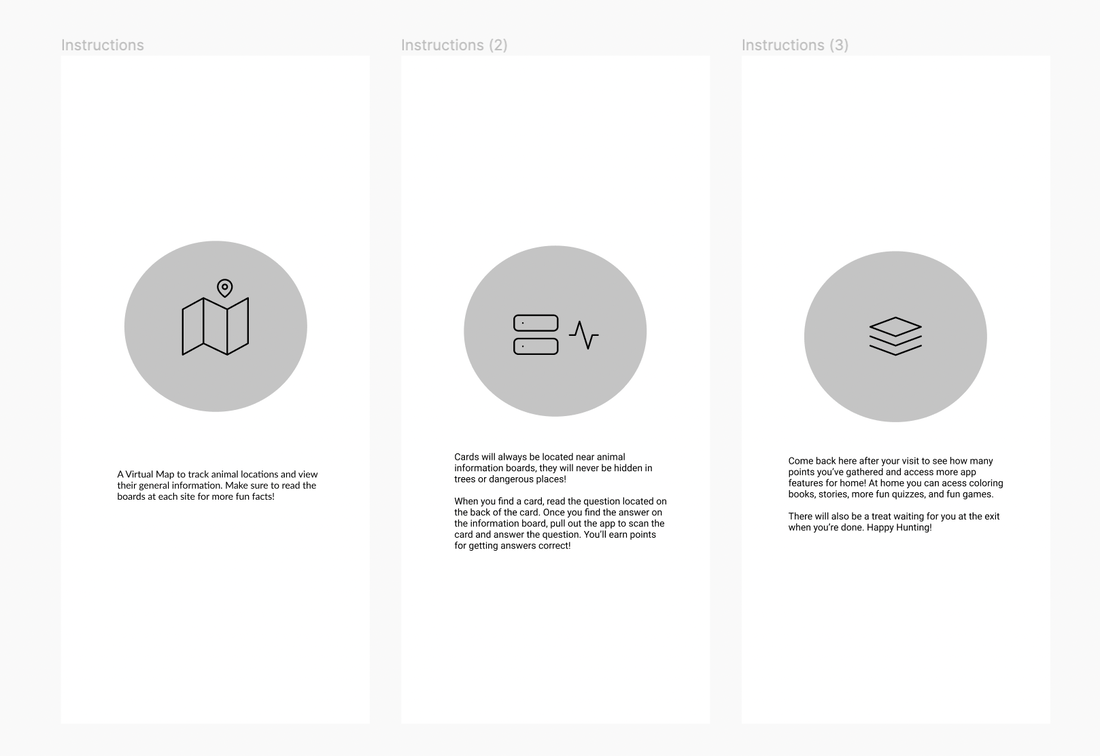
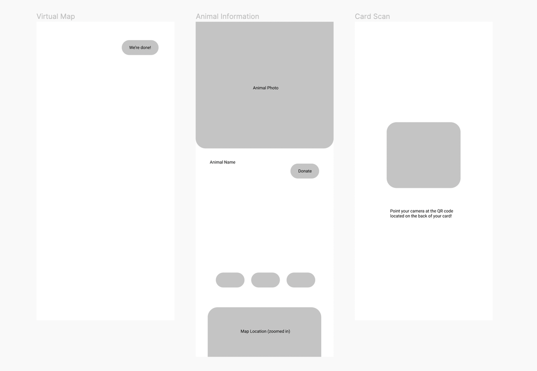
Wireframing
I created some very low fidelity wireframes to lay out what this experience might look like on a high level. The wireframe below doesn't show many details, but mainly shows the flow of the experience in the zoo from reading through instructions, through scanning cards in the app, to how the at home screens might be structured.
Initial Wireframe
|
|
|
|
Feedback
We got some feedback in this early stage of the process to figure out if our concept was making sense to people. Before moving forward, we took note of some of the concerns which mostly related to general structure and hierarchy. Here's what we noted:
- Keep the instructions at the beginning very easy and less wordy to remove any barriers at the start of the users experience
- Don't add too much information on the animals in the zoo portion so that visitors could rely on the information mostly to maintain the interaction with the physical experience
- Design our at home app screens in landscape mode vs portrait since it’s most accessible for kids. In at home mode, we are relying heavily on our visual and interactive content versus high content density.
Usability Testing
After the last stage, we made changes based on our feedback. We then created a higher fidelity prototype of mostly the physical experience to understand how our technology was working in the environment and how smooth the interactions were.
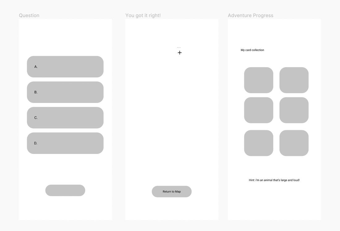
Due to covid restrictions, we ran remote tests. We tested seven people, some of which had provided feedback and insight at earlier stages in the process. Our usability tests were laid out in a powerpoint format in attempts to tell the story and paint the experience in real time, physical and technology interactions included. Here's a part of our test as an example:
Due to covid restrictions, we ran remote tests. We tested seven people, some of which had provided feedback and insight at earlier stages in the process. Our usability tests were laid out in a powerpoint format in attempts to tell the story and paint the experience in real time, physical and technology interactions included. Here's a part of our test as an example:
The test walked through the experience in this flow:
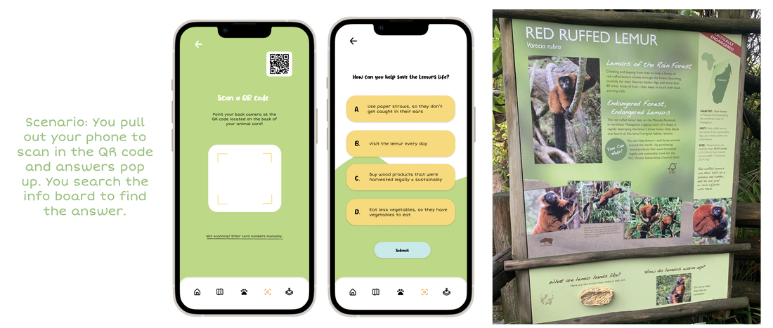
Arrive at the zoo → Spot our advertisement board → Scan QR code to download the app → Read through participation instructions in app → Choose an animal on our virtual map or explore → Arrive at the animals site and finding the scavenger hunt card → Read the question on the card → Look for the answer on the animals information board → Find the answer on the animal information board → Scan the QR code on the card to choose an answer in app → Gain points and animal friends → View adventure progress later on in the adventure → End the scavenger hunt → Create an account to save points and unlock at home content for later
We asked users to talk out loud through what they were experiencing, took mental note of how long it took them to find answers to conservation questions, and asked some guiding questions like "did you have any more questions after clicking through instructions" or "how easy and/or enjoyable was it to find the answers?"
Some of the responses we received were:
Our design shown below incorporated many of these changes. Due to time, some of them were not implemented but we have intention in further testing and changing more to fit our responses!
Arrive at the zoo → Spot our advertisement board → Scan QR code to download the app → Read through participation instructions in app → Choose an animal on our virtual map or explore → Arrive at the animals site and finding the scavenger hunt card → Read the question on the card → Look for the answer on the animals information board → Find the answer on the animal information board → Scan the QR code on the card to choose an answer in app → Gain points and animal friends → View adventure progress later on in the adventure → End the scavenger hunt → Create an account to save points and unlock at home content for later
We asked users to talk out loud through what they were experiencing, took mental note of how long it took them to find answers to conservation questions, and asked some guiding questions like "did you have any more questions after clicking through instructions" or "how easy and/or enjoyable was it to find the answers?"
Some of the responses we received were:
- Typography - Some text not readable because of color and/or size
- Process - Users sometimes weren't sure at what point they needed to pull out their phones to scan in cards. Should be more clear on the physical cards
- The Pandemic - How can we account for covid and germs when it comes to the scavenger adventure cards in the zoo?
- Instructions - Although there were instructions at the beginning, they should be accessible throughout since sometimes they forgot throughout
- Animal Friends - Users were unsure of what they could do with their animal friends at home or if they could access them
- Animal Language - Animal stories and names should show when viewing animal friends to provide background information and continually push feeling connected to the animal
- At home content - Users weren't really sure about the value of saving the points for later. What do they get for continued use? What kind of content is available?
Our design shown below incorporated many of these changes. Due to time, some of them were not implemented but we have intention in further testing and changing more to fit our responses!
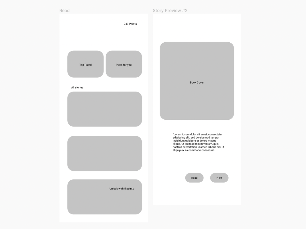
Deliverables
Woodland Park Jr.
Scavenger Adventure & Mobile App
My team and I prepared a presentation for our stakeholders and peers to show our final product. In the slideshow below, I show the entire experience from arriving at the zoo, through the app interactions, into the scavenger hunt app screens, along with previews of at home content. The photos below are intended to show the experience all the way from arriving at the zoo to being at home and using the at home content.
Click through the experience below! Please reference captions above each photo for context.
Stakeholder Satisfaction & Feedback
Woodland park Zoo representatives loved our project! Ultimately they thought it was fun and creative and did a good job mixing technology in without taking away from the physical environment. They also loved the learning aspect and objectives of this app. The addition of at home content was also appreciated, especially the animal songs.
Here's some feedback we got after our pitch. We hope to implement these changes in future iterations!
Here's some feedback we got after our pitch. We hope to implement these changes in future iterations!
- How can we encourage kids to keep/recycle the cards instead of littering them around the zoo?
- Gamification is the strong piece of our product, how can we amplify these aspects for kids?
- How can we emphasize the long term use of the app content more? What about the badge/rewards system? How does it function?
- Can we include narration/video of instructions on how to participate along with the words?
- Can we add a simulation of the zoo experience into the app? For example animal noises, environment/nature noises?
Measuring Success
We brought back our success metrics from our define stage to decide if our product could be considered successful. A successful product would solve the problem but also account for stakeholders goals and desires.
- Did our product actually improve empathy long-term in children? 🧒
If our team had more time to work on this and to work with the zoo, we would have loved to continue designing this product end-to-end and then pass it over to a developer so that we'd have something to test in the physical environment. With this complete product, we'd be able to ask children how they connect with the animals before and after our product as well as how they might be becoming more empathic over time with the continued use of the at home content. Though, based on positive stakeholder feedback alone we can say that this approach was an effective way to address the problem.
- Does our product enhance and not take away from the physical experience? 🐻
Again, we would have loved to test this product in the physical environment! Since we couldn't, we used remote usability testing to ensure we understood how tech experience tied in with the physical by laying it out and telling the story as if it were in real time. We used scenarios, actual zoo photos, and an actual task to determine when the user might need to use their phones. We also intentionally made this educational to make sure parents felt better about the tech use. Many of our users were excited to interact with the physical elements and found the idea of using this at the zoo to be a good supplement. Our stakeholders also loved how both were included. - Is our product accessible and understandable enough to engage children? 🎟
Through our usability tests we were able to confirm this! The kids that we tested with enjoyed the scavenger adventure part of our experience, and the colors and animal illustrations were very appealing to kids which we made sure of. We also made sure that the information provided on each animal included effective animal language for kids, and took kids attention span into account by gamifying the experience, adding a rewards and badge system, and allowing the parent to participate to increase that engagement as they lead by example.
Backlog
There are plenty of things we wanted to incorporate into this product and experience! Given our short period of time and other constraints, we added some things to the backlog.
|
Widen our audience 👥
When we talked about our idea to others, many outside of our target audience of kids expressed interest in using an app like this for the scavenger adventure portion, in app conservation questions included. Young adults, and even corporate professionals who use such activities for team building and bonding say they would use this in the zoo to make their experience even more engaging. Due to time constraints, my team couldn't explore what widening the audience might look like, though it's a great avenue to explore in the future!
|
More activities & more depth 🎲
We only designed a few screens of the at home content to demonstrate the minimal viable product due to lack of time. Though, in the future we'd love to show more range of activities that we might offer and even what specific activities might look like in action to further push the purpose and excitement of the at home content as well as how kids can use their points to their advantage in the app.
|
Reflection
Challenges
One of the biggest challenges we faced during this project was balancing the physical and the tech experience. The zoo had never explored technology in the environment, though other zoos had incorporated it in other ways and been very successful. We saw an opportunity to add tech into this environment as designers and innovators, though making sure we didn't cross the line of too much tech in a way that would offset the stakeholders was very difficult at times but very key to our success. In the end, we are happy that Woodland Park Zoo enjoyed our approach!
One constraint we faced here was time - with two and a half months it’s hard to get into the entire design process in depth without throwing out too many important steps such as user research and lots of usability testing. We did our best to prioritize what we could and were very intentional along the way in our design decisions.
One constraint we faced here was time - with two and a half months it’s hard to get into the entire design process in depth without throwing out too many important steps such as user research and lots of usability testing. We did our best to prioritize what we could and were very intentional along the way in our design decisions.
Takeaways
This project was my first time working with stakeholders and I loved the experience! As someone who is super detail oriented and values intentionality as a designer, it was nice having some guidelines such as values and goals outside of those within the team to always refer back to throughout the design process. This is one of my favorite projects so far!