Note: This case study is under construction, but please feel free to browse the high level explanation and interface design!
|
Smart Parent.Website Proposal, 2021
Project Duration: 2 weeks
My Role: Project Manager & Interface Designer |
OVERVIEW: Growing up with trauma is very common, and who we are as adults is always rooted from how we were raised in one way or another. Smart Parent is an original idea generated by me and cross functionals, a parenting website targeted towards aspiring or soon to be parents. Users will first take an assessment on their parenting style to recognize their ideals and/or habits behind parenting, then an attachment style quiz about their future kids to determine desires they have for their future child. Using this information, Smart Parent provides them with results that show any alarming behavior and points out disconnects between their ideals and desires. We match users with personalized recommendations, helpful resources, and provide a community aspect with the option to build a list of connections. Results to each quiz can change with time and effort, so users can come back to take the assessment to document growth or further room for improvement. Our goal is to educate users, then catch and hopefully reverse alarming behaviors and patterns before people are even parents to stop the cycle of adults having to heal from their childhoods.
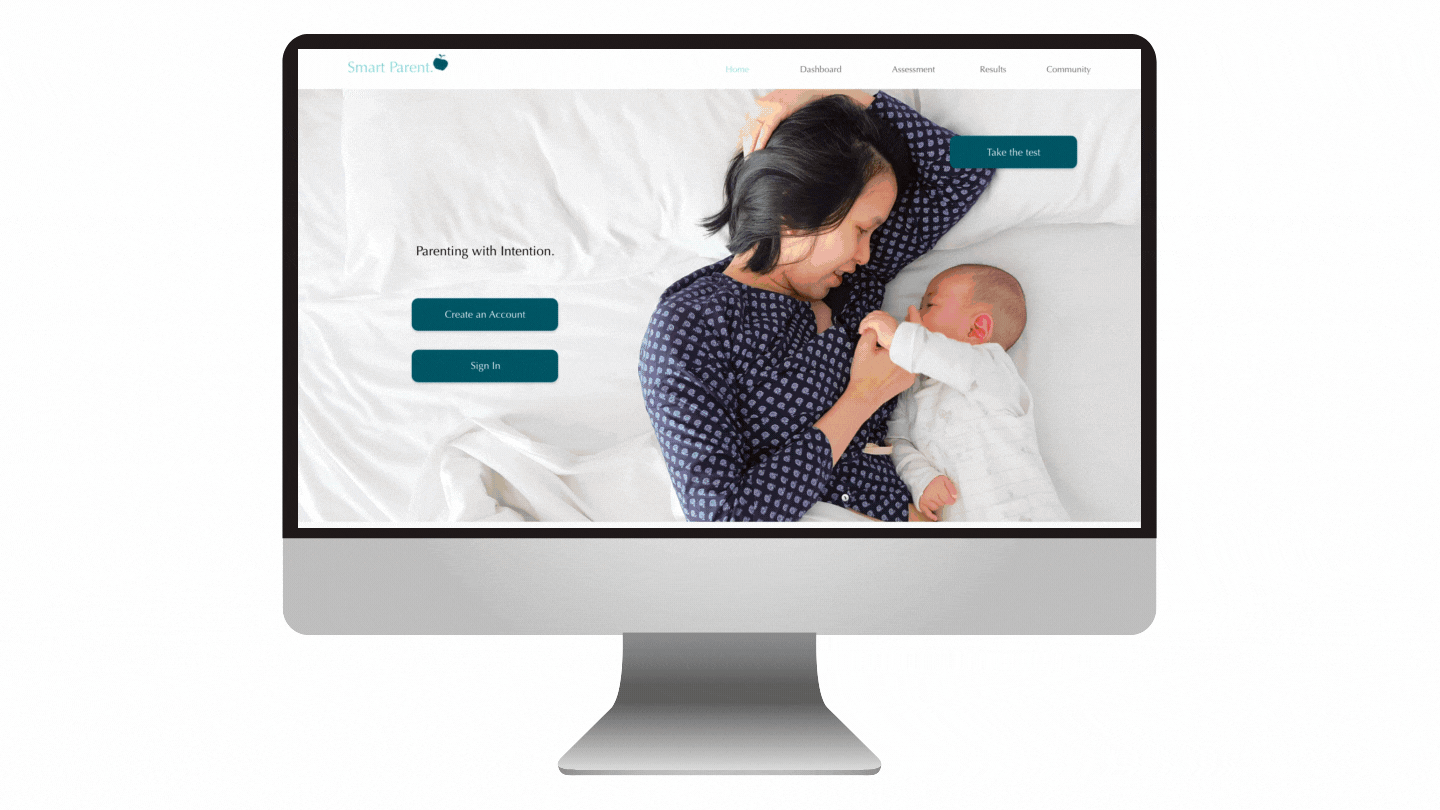
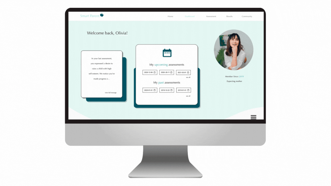
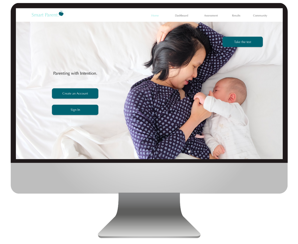
CHALLENGES: This project was a design sprint that lasted two weeks, where my team and I were given the task of creating a website for parents. The first challenge was spinning this in a way that was different and unique. In ideation stages, we thought to create a general Parenting Style Quiz - though we struggled find what would set us apart from other quizzes and products out there that did the same thing. I knew a lot about Attachment Styles - which are responsible for the bond that develops between adults in emotionally intimate relationships. These styles are centered and molded starting with how children and parents interact, so I thought this would be the prefect addition and explained the connection to my team. The next challenge was to start actually start pulling pieces together - like the color scheme and logo from our graphic designer Lauren, research on each style from our researcher Stella, and user flows and scenarios from our UX researcher Kenneth. As the website designer for this project, two of my main goals were to keep it informational and engaging while still not too cluttered or overwhelming. With this in mind, I put heavy emphasis on the content, placement, colors, and icons, and simplicity to make this website look professional while still serving its purpose. I also learned to make the mockup interactive so that viewers could navigate through it normally - and accounted for multiple different flows.
RESULT: Using Adobe XD, I completed this mockup for the project! I ended up taking on two major roles in this project due to unforeseen circumstances in the team, so being the lead designer and project manager was stressful, but we made it through together. My team and I are happy with the outcome and hope to continue designing a full website for this piece in the near future, as well as trying to develop it into an actual and functioning website from scratch using code.