|
OverviewMy task for the summer was to figure out ways to increase traffic to My Support Dashboard on Nintendo's Customer Support website, a service which helps customers troubleshoot issues on their Nintendo Switch game devices. Through research, exploration, and some guidance I came up with four different solutions to increase conversion.
|
The problem
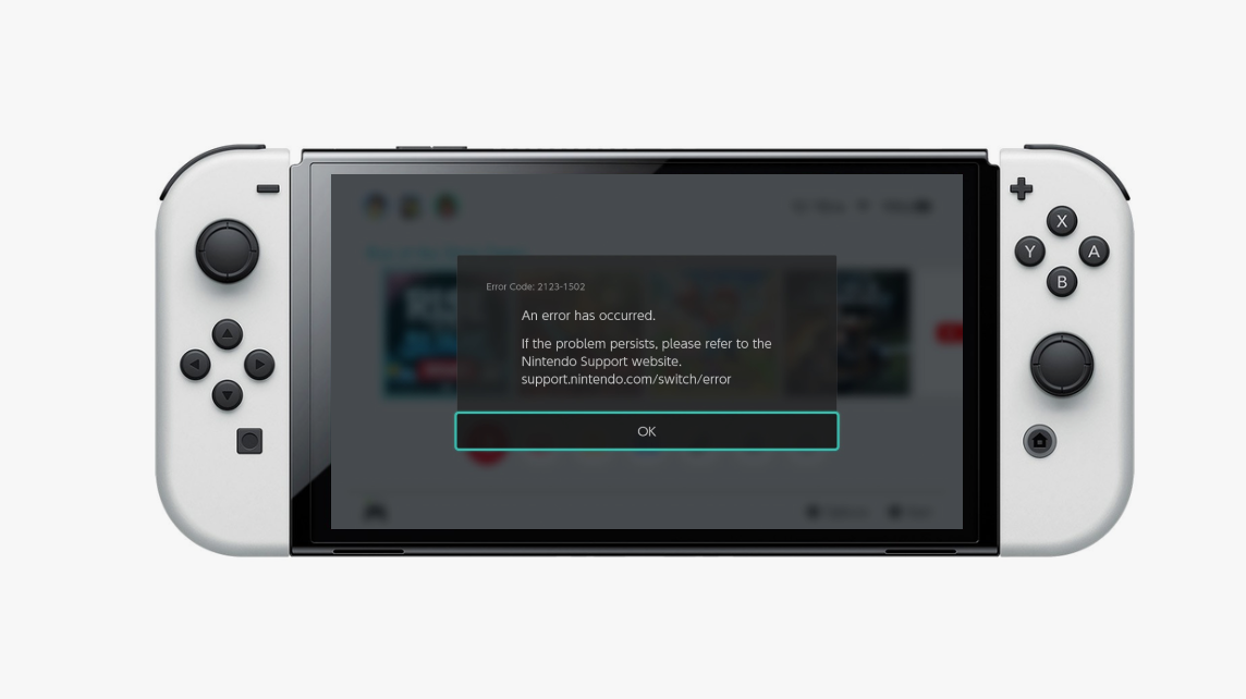
The Nintendo Switch is the game device below, and the screen display shows an example of an error code that can pop up when something has gone wrong. You can imagine how someone in the middle of playing might get really frustrated by this disruption. In order to keep this message off of the screen, players have to go find the answer.
The typical process to find the answers to issues like this one (without MSD) is as follows:
1. Search for the error code into their browser or Nintendo’s support website
2. Scroll through those search results, to then hopefully come across a
3. Come across a solution that solves their problem - sometimes this isn't a quick process and people often struggle to find the correct answer.
What is My Support Dashboard (MSD)?
MSD is a service created by the UX designers on the consumer service team and it simplifies this process for customers. Instead of going through the searching process, if users have signed up for this service all they have to do is:
1. Visit MSD on Nintendo Support site
2. Find the exact error code detected on their device along with a solution for it
My Task
My task was to figure out ways to increase MSD adoption since customers were not using the service as much as the team had anticipated. I was specifically asked to identify opportunities throughout the Support Site to encourage people to use the service more. Below are some use cases and constraints that I had to consider and design around:
My task was to figure out ways to increase MSD adoption since customers were not using the service as much as the team had anticipated. I was specifically asked to identify opportunities throughout the Support Site to encourage people to use the service more. Below are some use cases and constraints that I had to consider and design around:
|
Use Cases
|
Constraints
|
Audience
The first thing I wanted to do was understand the audience to be clear who I was designing for. The team didn’t actually have any analytics on the audience, so I pulled together pieces of information about the users from having different conversations to create the below high-level personas.
I asked the designers on the team who they typically had in mind when designing, got some insight from someone that worked on the chat side of customer service who dealt with customers and issues directly, and gathered some analytics from the main Nintendo site’s CX lead since they did track their audience - I figured even though they technically have different audiences, some of that information could help paint the picture of who was coming to the support site for help.
I asked the designers on the team who they typically had in mind when designing, got some insight from someone that worked on the chat side of customer service who dealt with customers and issues directly, and gathered some analytics from the main Nintendo site’s CX lead since they did track their audience - I figured even though they technically have different audiences, some of that information could help paint the picture of who was coming to the support site for help.
|
Linda H.Linda who’s a mother with a kid that has a Nintendo Switch, she needs answers because her kid is getting cranky and an easy process to solve issues. This persona represents any parents/guardian who often come to the support site to solve their kids device issues.
|

|
Kyle B.Kyle who represents a kid who knows how to use the internet himself. He just wants to get back to playing, and is intimidated by calling for help so really relies on the web to solve his issues.
|
|
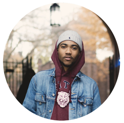
Trent J.Jayden who represents the age of those ages 20-25 that play this device. He’s a hardcore gamer, doesnt like wasting his time, and just wants immediate solutions.
|
Research
Immersion
I did an immersion to familiarize myself with Nintendo’s Support site before even attempting to design anything for the space. Here are the main things I noticed:
|
🤔
I was initially confused on the purpose of MSD
There wasn't really anything in depth explaining what the service was and why it might be useful for someone. As a user, I probably would have never signed up for it either for this reason - so this would mean my proposed designs could be more informative.
|
🎞️
There were no photos, minimal graphics on the site
There were only a few Nintendo IP’s, though, the team was moving away from them all together because of new restrictions. With this, I knew the site had the possibility of feeling very text heavy so I wanted to figure out a way to bring some life into the page.
|
🎭
Voice of customer support was different from main site
The main site was very colorful and light, while this site was a lot less colorful and more serious. This was important for me to understand so I was careful to design something that'd be fitting for the support pages specifically versus Nintendo as a whole.
|
Web Analytics
I had a meeting with the teams web analyst to get an understanding of how people were navigating throughout the site. These are the most important pieces of information:
|
🚸
Most overall site traffic came directly from search engines
Customers would start their troubleshooting on google for example and end up directly on a solution within the website - which told me that the home page had very little traffic. I originally thought that might be a great place to add a design but it turned out to be the opposite of my assumptions.
|
🚦
MSD traffic came from those already on the website
Customers didn't typically find MSD from search engines or elsewhere, they were coming from random places throughout the site. Not too many people would discover/understand the service unless they were in a place on the website that had information about it (which was very hidden in an article).
|
🙍
MSD visits in were in the bottom half of all site traffic
While it was clear to the team that people were not using the service because of the number of sign ups, the analytics made it clear that people weren’t really clicking on the service at all. It was clear there had to be more information throughout the site to encourage people to click on it more.
|
Team insight
I had conversations with other designers on the team to ensure I could make informed design decisions that were inline with everyone's expectations. Here's what's I gathered:
|
🖼️
Bring life to page
Some people on the design team desired things that brought the website to life like photos, patterns, etc, the page was lacking them.
|
🎨
Try a banner design
My manager was interested in seeing a banner design with language around personalization to capture people's interest.
|
📏
Create something familiar
The team wasn't looking to reinvent the wheel they wanted something familiar simply because they just didn’t have the time or hands for much else.
|
Analyzing Support Sites
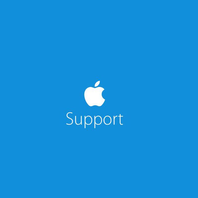
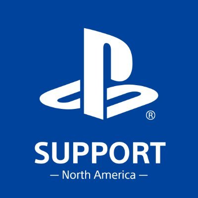
Before I dove into design, I looked into a few different companies' support pages to understand the feel and idea of support in general and how companies approached that common goal of getting people help. I looked into xbox and playstation because they’re gaming companies, and apple because a few on the team were fans of its support pages.
|
|
|
The things that set all of these support sites apart was their use of photos and illustrations that brought life to the interface. Though support was about getting answers, they still all found a way to add a lightness into the support experience. I wanted to add some of this into Nintendo Support with my design. It was tricky, because as bad as I wanted to use Nintendo IP like Mario or Kirby, I wasn't able to use characters at all. They also didn’t have many custom icons available, so I needed to figure out a different route.
Exploration
Here’s a look into my initial exploration, very low-fidelity mockups to put my ideas on the cavas and to get feedback about direction before moving forward.
They’re all a little different, but have the same content and language around personalization and customization as requested. I remembered from the personas that all of them just wanted quick answers to get back to playing, so I added in “Get back to playing faster with My Support Dashboard” which was a phrase used in MSD previously, along with some information about MSD since there seemed to be a lack of explanation of the service.
They’re all a little different, but have the same content and language around personalization and customization as requested. I remembered from the personas that all of them just wanted quick answers to get back to playing, so I added in “Get back to playing faster with My Support Dashboard” which was a phrase used in MSD previously, along with some information about MSD since there seemed to be a lack of explanation of the service.
|
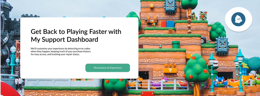
This idea was a banner to represent the idea of a prominent image background with boxed content on top. The Nintendo game scene background was lively and colorful to bring attention to it.
|
|
|
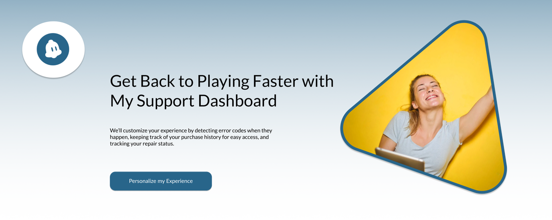
This idea shows a not so prominent image of someone excited about the service with a gradient instead that used colors from the website.
|
|
|
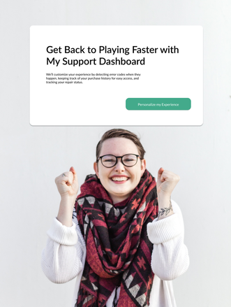
These are ideas to be placed in the sidebar of the website, the first one being very simple (no graphic added yet), and the second using a real persons photo again to show the excitement of getting answers quickly and customizing the experience.
|
|
|
The team liked the use of photos and colors, though the main issue is that they looked too much like ads. This made sense, especially since there weren't any photos anywhere else on the website, so these might stand out and maybe not in a good way and would have created the need to add photos in more areas throughout the site so that they fit in more, which would be creating another problem to solve.
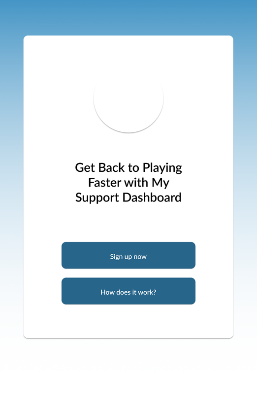
At this point, my manager wanted me to explore something that wasn’t a banner, and to design for mobile first instead, so I went back to the drawing board.
At this point, my manager wanted me to explore something that wasn’t a banner, and to design for mobile first instead, so I went back to the drawing board.
Proposed Solutions
Through many iterations and feedback sessions with my manager and team, I came up with the below four solutions that addressed each use case identified earlier in the project. I added each design into the actual pages on Nintendo's Support Site to show how they would look in the space.
For reference, Knowledge Articles are on the support site and have answers to different issues (including error codes).
For reference, Knowledge Articles are on the support site and have answers to different issues (including error codes).
Solution 1
Incorrect Knowledge Articles
|
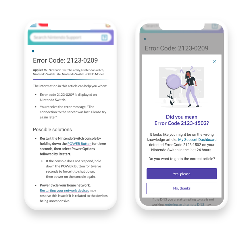
This first solution is for a customer who is signed in, has the MSD service already, and for some reason they just aren’t utilizing it; maybe they forgot about it, so they ended up on an article that won’t have the answer to their problem.
For example, we see they are on an article for error code article 2123-0209, which is not what’s being detected on their game device. This system-initiated modal pops up after about 5 seconds asks if they meant the detected error code. I hyperlink to MSD just in case they want more information about the service, and offer to direct them to the article that will solve their problem.
I’d say the biggest challenge here was figuring out when the modal should pop up or if it should pop up at all since pop ups can be frustrating to users. Though, after having conversations with my manager and team, we thought that getting in someone's face is what we want to do in this instance, since continuing to read the same wrong article for a long time would likely cause more frustration.
Solution 2
|
Contact Us Page
|
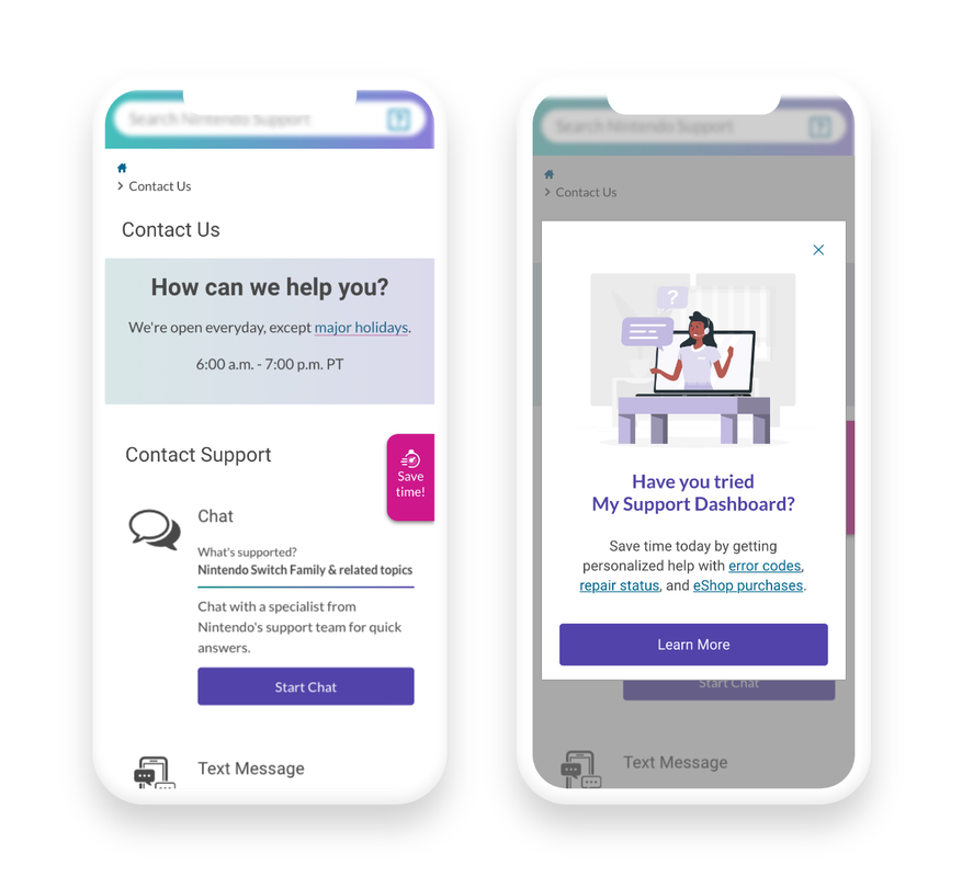
This solution is for those on the contact us page. For reference, the main goal on this page is to steer people away from hitting the call button because it costs money. Since many issues can be solved with MSD, I added a bright pink tab that lives to the right of the page. Upon click, it opens a modal which we see to the right. I added an illustration relating to support and agents so it still feels somewhat personal. It asks if they’ve tried MSD, and the text explains everything that can be done with the service with hyperlinks to each one to get started, or a Learn More button for more information.
Right now, the Learn More button would direct users to this really long article that explains all about MSD but it’s hard to follow and it’s pretty hidden, so I also proposed the creation of a landing page for MSD specifically that explained exactly what could be done with the service. Such a page could be the in-between of hearing about the service and signing up which in itself could convert more people to use it.
The biggest challenge here was weighing lot’s of feedback about the tab placement. Most on the team liked it where it is, some thought it should live lower on the screen, on the left instead, on the very top above everything, at the bottom, things like that. I took each into consideration and reconnected with my immediate manager on it again, and we ended up leaving it where it was because it has the most open space, looked the least cluttered, and was close to the contact support options which might capture someones attention just at the right time before using other support options.
Solution 3
Search Results Pages
|
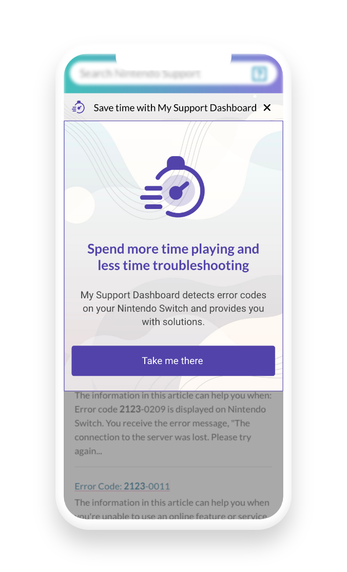
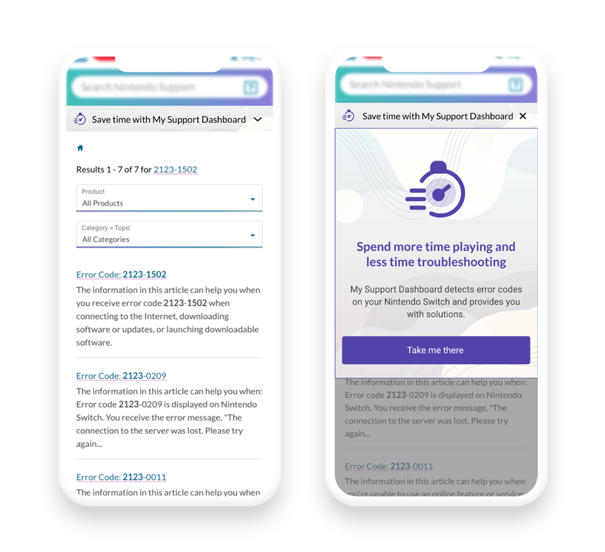
The next solution is a drawer that is meant for those searching for an error code article on the website. The logic here is that if they are on search result pages, we know they aren’t utilizing the service since it would cut out this step completely, so this is the perfect place to promote a faster route to find the answer.
The bar is fixed to the top of the screen so customers can always see it with language around saving time to capture their attention. The drawer opens by tapping the carrot and looks like the image to the right in it’s opened state.The icon again related to saving time, and I added a light patterned background that looked similar to the current color scheme of the website. The take me there button takes them directly to MSD to get it signed up.
Something I learned here was the value of presenting multiple solutions. My immediate manager liked this drawer idea but since it was a new interaction that the developers had never implemented, she didn’t want to scare the them away or scare the stakeholder. So, I created a different solution to show first that was just another modal design like the previous one.
In the end, the stakeholder ended up really liking this new interaction when it was showed even though it was a little different, and mentioned that she would be willing to push for extra time in development to make it happen since it could be very effective.
Solution 4
End of Knowledge Articles
|
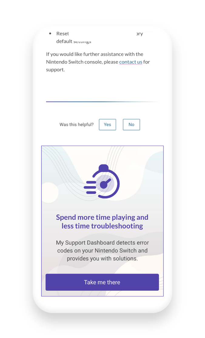
This solution is the similar to the last one, except I just used the content from the drawer without the bar. This is placed at the end of articles - if they are at the end we know they either found the answer to their issue in there or they didn’t, in both instances they didn’t use the service. If they did still find the answer, they will see this and know they can do so faster next time. If they didn’t find it an answer yet, they’ll hopefully notice this and click the button to help speed up that process.
Though this solution was made for the end of error code articles which was my task, the content of this tile could be changed to address different issues. For example, repairs and is also a part of MSD, so if this happened to be placed at the end of the repair article, the content could just be tweaked a little still work to promote the service. My manager really appreciated this versatility and the fact that I considered things beyond the scope of my assigned project.
Though this solution was made for the end of error code articles which was my task, the content of this tile could be changed to address different issues. For example, repairs and is also a part of MSD, so if this happened to be placed at the end of the repair article, the content could just be tweaked a little still work to promote the service. My manager really appreciated this versatility and the fact that I considered things beyond the scope of my assigned project.
Feedback
I presented my solutions to the team and more including the president of Nintendo and everyone really enjoyed it! Here are some of the compliments I received on at different points:
I always ask for feedback as well to improve, so some things mentioned were:
- ”I appreciate that you used inclusive illustrations”
- ”The designs are universal and can be applied to multiple use cases”
- “I like that you introduced illustrations, we’ve never used them before and it gave us new ideas”
- "The placements were well thought out and intentional"
I always ask for feedback as well to improve, so some things mentioned were:
- “I’m interested to see different interactions, like mouse hover vs system-initiated”
- “Play with adding them on more pages to test for more instances”
- “Could some of these be placed in different areas of a specific page for more visibility?”
- “The tab being a slide out instead of a modal is a new interaction for us but would be more intuitive”.
With more time
I would have loved to go back and account for all of the feedback because there were great points and and I wanted to explore more and make some changes, but my time there was limited so I left it as is. I also highly value usability testing - in all of my other projects we’d observe the designs with the intended audience which gave many valuable insights, so if I had the opportunity to do so here I definitely would have to validate my design decisions before passing off my work.
Measuring Success
The original plan was for these to go live at the end of my internship, I passed them over for development through Zeplin, though the development date was pushed back a bit since the developers were working on a different monster project so I don’t have actual KPI’s yet to prove that they worked. So, we determined success by qualitative things like stakeholder satisfaction/approval, positive feedback, and correct completion. My solutions accounted for all use cases, they were realistic with development considerations, and the solutions were approved by the stakeholder. So, we deemed this project a success!
Reflection
Takeaways
I loved this project! This was my first time working and designing for a major company, and it was a new experience navigating all of the rules and restrictions that it comes with. I thoroughly enjoyed considering the business needs, user needs, and team needs along the way. Being the only UX/UI Intern on the team that summer, I had to opportunity to learn from those senior to me and lean on my team and others in the company when I needed to gather more information for a great project outcome!